The Project: Online since 2006 as Metroitaliane, CityRailways has developed by always trying to maintain a balance between professional topics and the interests of track and electric transportation enthusiasts while always keeping an eye on data, numbers and communication aspects.
I was the founder of this site which I carried on for many years with Andrea Spinosa to whom in recent years I have left it in management. I continue from time to time to write something when I can find the time because one of my passions is trains, streetcars and subways.
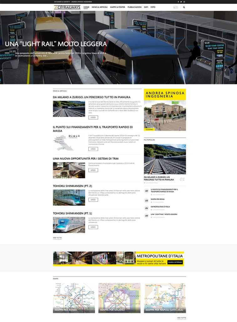
Site: Makeover of the CityRailways site to bring it up to the latest web and graphic standards. A minimal black and white was chosen to create more contrast with the images and maps of the transportation systems, both of which are very colorful. The site has a “dark” mode that renders the pages in negative and is useful for those who want to strain their eyes less.
Tools: WordPress + Elementor
Client: Eng. Andrea Spinosa
Publication date: 2020
Logo
Questo logo, ormai iconico nell’ambiente dei trasporti in Italia, è stato disegnato da me ormai molti anni fa, nel tempo è stato fatto un redesing mantenendo il pittogramma con l’incrocio delle linee stile mappa della metropolitana ma aggiungendo due barre sopra e sotto per simboleggiare i binari ferroviari. Il logo funziona molto bene sia in nero che in bianco, è stato pensato fin dall’inizio per un uso in positivo e negativo.
