Buffet della Stazione Lugano
This is one of the most extensive visual identity projects I have done in recent years. The restaurant at the Lugano station underwent a total makeover when work on the station itself was completed. New furniture and a more elegant, modern and retro style at the same time. It was therefore necessary to renew the whole visual dentity in order to reflect the new style and make the whole visual imagery consistent. Therefore, I identified a style that partly echoes Art Nouveau but is still anchored in the present day, seeking a “timeless” result.
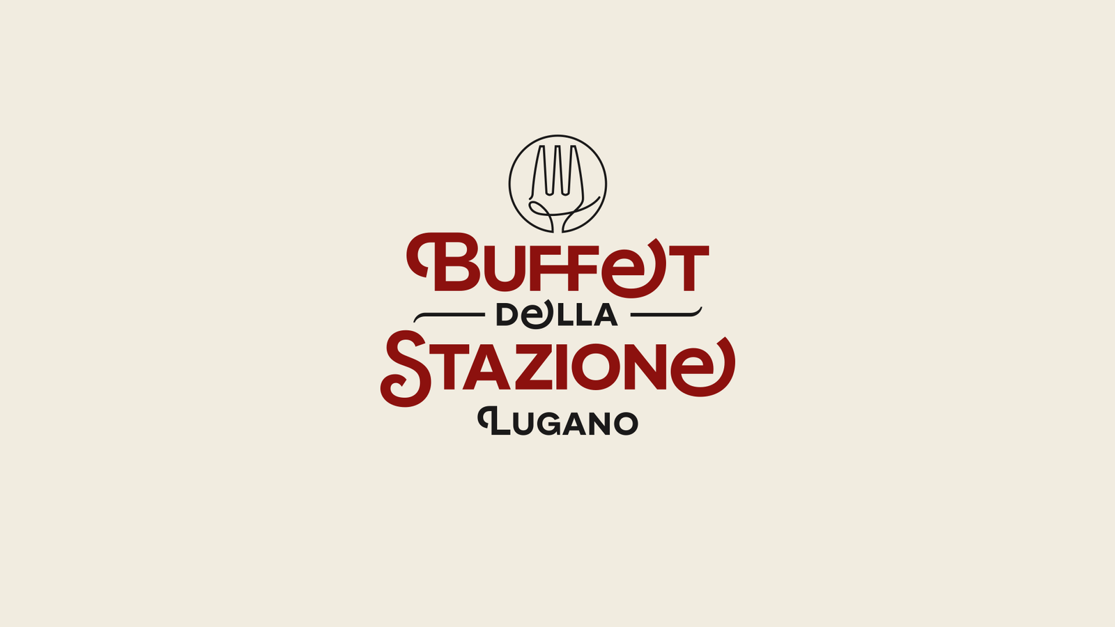
I wanted to underline that the fork, an overused element for restaurants, was not my choice but a request non-negotiable from the client. At least I tried to make it a little lighter but my personal choice is for the version of the logo without a fork!
If you pass by the station and see the totem pole with the Station Buffet logo, remember me!
Client: EXM/Creative via Latitude 46
Year: 2025
Website
I also made a small showcase site where you can make a reservation. The site incorporates fonts and colors from the visual identity.
Site: WordPress / Elementor


More to see


