CityRailways
The project: Online since 2006 as Metroitaliane, CityRailways has developed by always trying to maintain a balance between professional topics and the interests of rail and electric transportation enthusiasts, with an eye always on data, numbers, and communication aspects.
I was the founder of this site which I carried on for many years together with Andrea Spinosa to whom I have left the management in recent years. I continue from time to time to write something when I find the time because one of my passions is trains, streetcars and subways.
Site: Makeover of the CityRailways website to bring it up to the latest web and graphic standards. A minimal black and white was chosen to create more contrast with the images and maps of the transportation systems, both of which are very colorful. The site has a “dark” mode that makes the pages look negative and is useful for those who want to strain their eyes less.
Logo
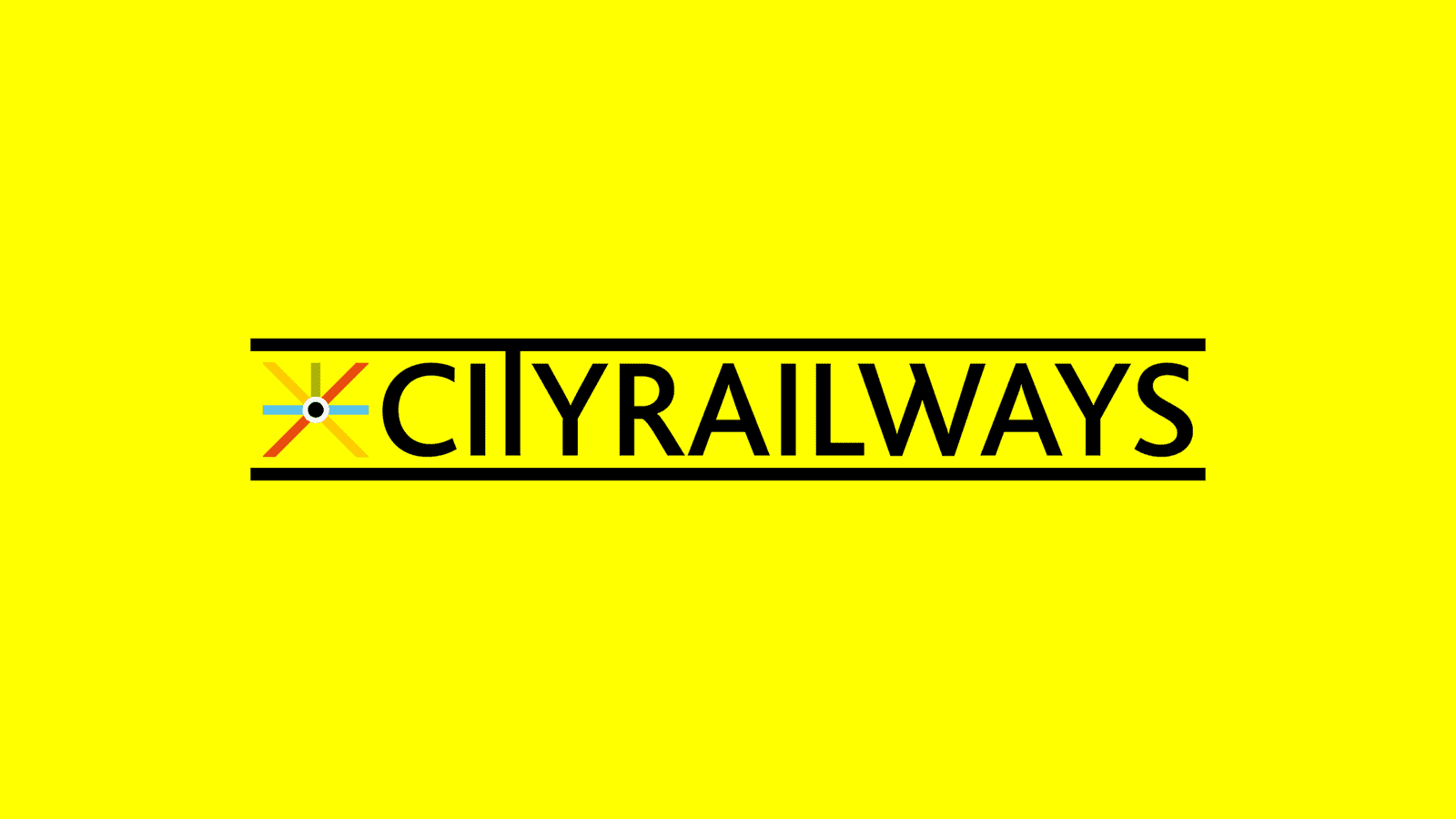
This logo, now iconic in the transportation environment in Italy, was designed by me many years ago now, over time a redesing was done keeping the pictogram with the crossing of the lines subway map style but adding two bars above and below to symbolize the railroad tracks. The logo works very well in both black and white, it was designed from the beginning for positive and negative use.
Tools: WordPress + Elementor
Client: Eng. Andrea Spinosa


More to see


